
Eclipta
Tools Used
Overview
Personal Contributions

What is Eclipta?
Eclipta is a start-up business in the natural eyelash-enhancing sector. They began with a single product – a herbal-infused oil blend for natural eyelash enhancement – created by Nature’s Mercantile. Building on its success, the brand expanded to include additional products and is now developing the Eclipta Men line.
Project Scope
Our scope for the project includes establishing a cohesive brand identity and seamless shopping experience for consumers. In completing the project, we would:
- Redesign the Shopify website on Figma
- Design an Amazon store in Figma
- Create a guideline for easy implementation of the Shopify questionnaire and Amazon Store building
Project Milestones

Review of Eclipta's Rebranding Work
Goals:
- Understand Eclipta’s identity and personality
- Understand Eclipta’s branding guidelines
- Understand Eclipta’s target customers, market definition, and reasons to believe in the brand
Methodology:
A review was conducted on Eclipta’s rebranding work, focusing on Eclipta’s new branding guidelines and how it emulates its desired brand perception. We examined texts, including the Eclipta Fall 2024 Rebranding Project transition documentation and brand guideline documentation.

Takeaways:
- Our analysis of Eclipta’s rebranding provided valuable insights into the brand’s identity, positioning, and target audience.
- Eclipta aims to establish an upbeat and authentic presence across platforms like Shopify and Amazon, using static and dynamic media for communication.
Interviews
Goals:
- Understand the current market for skincare and eyelash serums
- Understand the concerns (or lack of) people have about their skincare
- Understand how people find out about their brands
Methodology:
We interviewed six users to better understand customer thought and decision processes when using/purchasing skincare and/or eyelash serums. We asked questions surrounding users’ skincare and concerns, as well as the method by which they found their preferred brand.
Takeaways:
- Interviewees use a variety of different beauty products but tend to lean more into popular, mainstream brands
- Interviewees tend to choose products that will give the best results. They do not look at the ingredients or whether the product is natural
- People tend to purchase their products from easily accessible makeup stores and easily accessible providers
User Empathy Map
Goals:
- Understand respectful female and male user attitudes and needs, and see where they differ and overlap
- Analyze our user interviews in a different approach/perspective for possible new insight by gender
Methodology:
Though interviews helped gather overarching themes with our primary user group, we felt we needed to conduct another round of analysis by our secondary user groups (women aged 30-60 and men who aim to restore or strengthen their facial hair). We first separated the responses by gender and organized user interview insights by hear, sees, says & does, thinks & feels, pain, and gain.
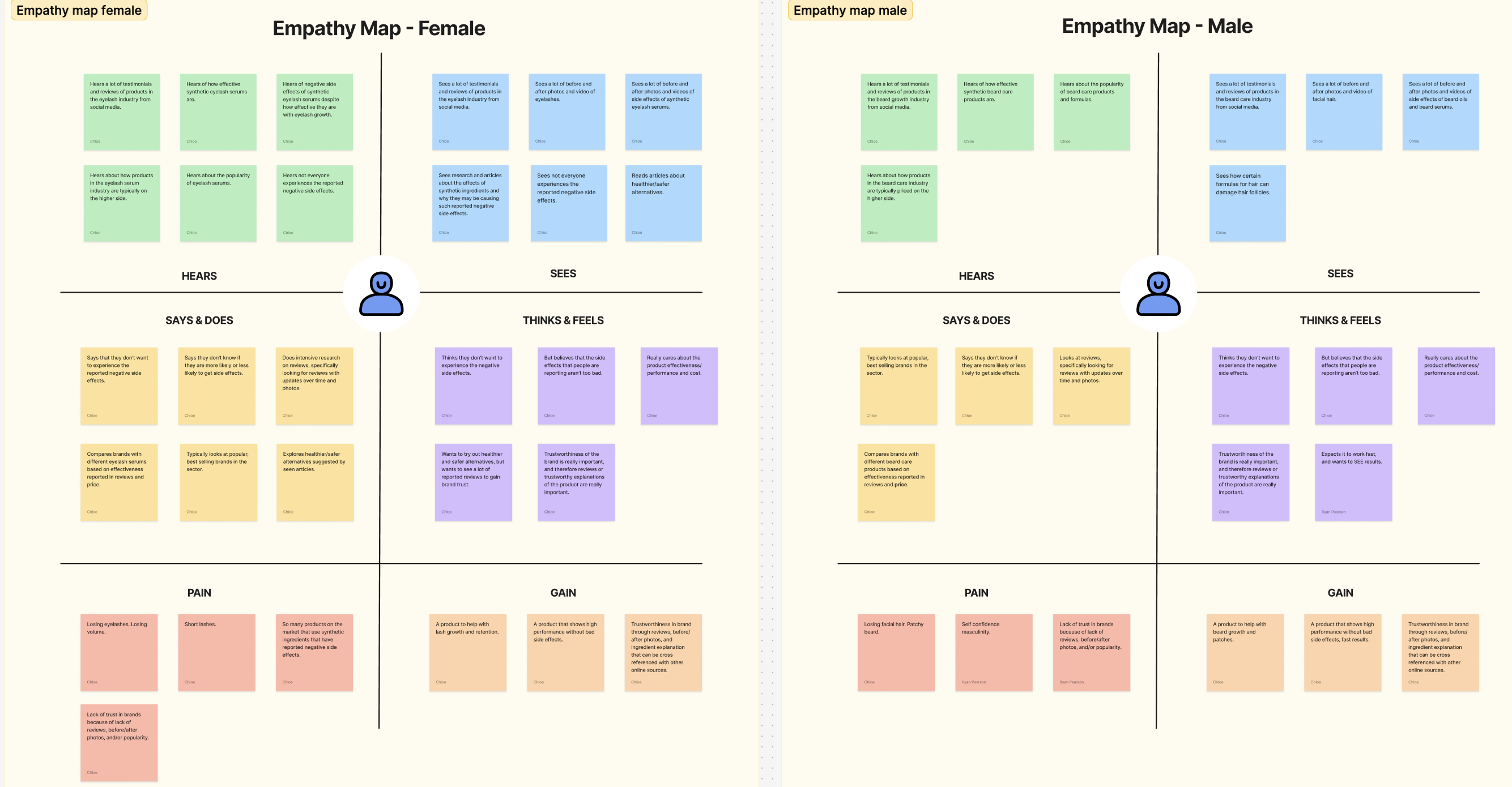
Takeaways:
Users like knowing information about cost and effectiveness out of motivation to find a solution for their personal needs. Therefore when redesigning Shopify, it will be very important that we inform users clearly about cost, effectiveness, and value proposition catered to specific needs.
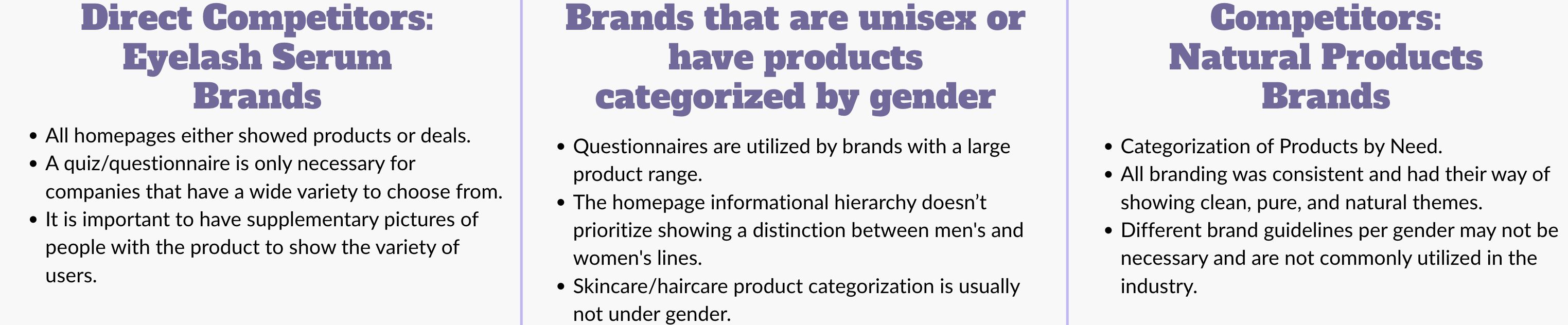
Comparative Analyses
Goal: Compare aspects of other top competitors and creating a standardized matrix to analyze trends and gaps
Methodology:
Our team conducted 3 rounds of comparative analyses with three different types of competitor groups.
Questionnaire Style Guidelines
Goals:
- Guide users toward personalized product recommendations
- Eliminate unnecessary friction during the shopping experience
Methodology:
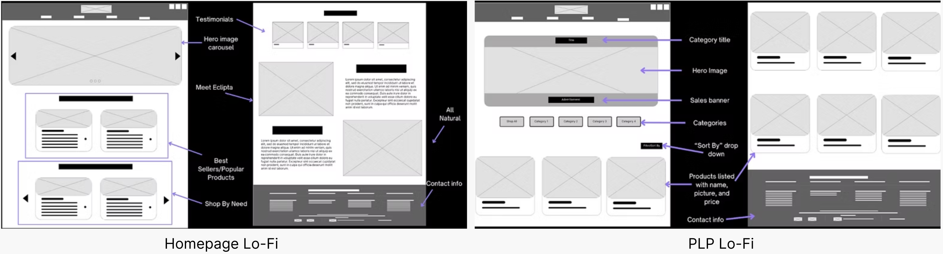
Using research on competitors, heuristic evaluation, research on style guidelines for e-commerce websites, and what customers want out of this website, we put together low-fidelity wireframes of the homepage and the product listing page (PLP). These wireframes started with our ideation sketches and evolved through various stages using team feedback on what aspects of the wireframes worked and what did not.
Takeaways:
By avoiding overly technical language and hyper-specific questions, we aimed to create a quiz that feels approachable, effective, and genuinely helpful. This questionnaire strategy is designed to enhance the Eclipta shopping experience by making product selection easier, faster, and more personalized.
This tool serves as a digital touchpoint to:
- Personalize product recommendations
- Reduce decision fatigue
- Educate users through guided selection
- Increase conversion through relevance
Ideation & Sketching of the Shopify Website
Goals:
- Draw on previous research and interviews to create informed designs
- Critique and refine our designs before transitioning into the low-fidelity/wireframe stage
Methodology:
We drew on previous research and understanding to assemble our initial ideas for the home page.
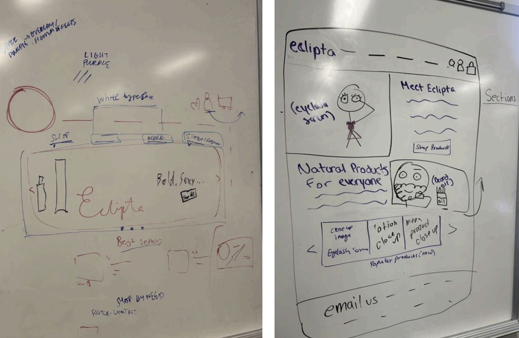
Takeaways:
After discussing our sketches with the entire team, we found these overlaps from both:
- A New Heading to Set the Tone
- A Hero Image Carousel to Engage Users
- Product Spotlights to Show Users What’s New
- A Different Way of Sorting
Journey Mapping
Goal: Combine insights from heuristic analysis and cognitive walkthrough into one visual deliverable
Methodology:
Building on insights gathered from our heuristic analysis and cognitive walkthrough of the current site, we developed a comprehensive journey map to visualize the user experience, identify pain points, and uncover opportunities for improvement.
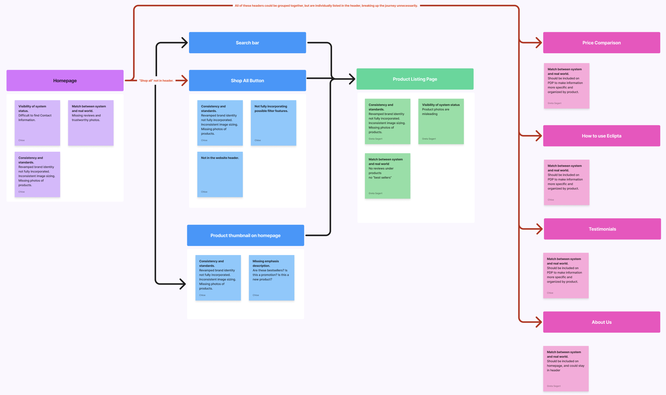
Takeaways:
We saw that the biggest touchpoints when navigating through the website are the navigation bar and the different clickable links. Our team hopes to entertain simplifying navigation with possibly a new navigation bar and incorporating more touchpoints throughout the homepage as a user scrolls.
Heuristic Analysis
Goals:
- Assess how usable the Eclipta homepage and PLP is based on Nielsen Norman’s 10 usability principles
- Speculate possible solutions to how violated usability principles can be improved
Methodology:
We conducted a heuristic evaluation to assess the usability and user experience of the Eclipta Homepage and PLP. This process helps ensure that Eclipta provides a more intuitive, efficient, and user-friendly experience.
Takeaways:
The heuristic evaluation revealed key usability issues on both the Eclipta homepage and PLP, including inconsistent branding, lack of product visibility, and minimal support content. Despite no critical issues in some heuristics, clear opportunities exist to improve recognition, trust, and user control, ultimately enhancing the overall experience.
Low- & Mid-Fidelity Wireframes
Goal: Create wireframes of Eclipta’s homepage and PLP to validate layout and content structure

Shopify High-Fidelity Design
Goals:
- Incorporate feedback from user testing of low-fidelity wireframes into designs
- Highlight industry standards and make designs more consistent
Methodology:
Finalizing our design into High-Fidelity mockups, we used feedback from past meetings and heuristics to refine our Lo-Fi’s and Mid-Fi’s into professional screens intended to be integrated into Eclipta’s Shopify.
Competitor Amazon Stores
Goals:
- Understand how Amazon stores are designed
- Understand what Amazon store features are necessary when showcasing a brand
Methodology:
We conducted a Competitor Amazon store analysis to better understand how Amazon stores are designed and what features are necessary. We chose brands that were popular or known for their good designs. We also chose one brand that is a hair and body care brand, similar to Eclipta.
Takeaways:
After looking at these competitors, our team found that when making an Amazon store, it is important for brands to stay true to their brand identity through colors, graphics, images, and attractive images of products all while adhering to the clean display look that the Amazon platform has. When creating Eclipta’s Amazon store, we hope to utilize banners of both products and product application and elements from Eclipta’s brand guidelines such as colors, typography, and logo.
Amazon High-Fidelity Design
Goals:
- Design an intuitive and user-friendly interface that streamlines the shopping process and improves customer satisfaction
- Apply cohesive branding elements throughout the design to reinforce Eclipta’s visual identity and build trust with users
Methodology:
For our Amazon high-fidelity designs, the approach focused on ensuring a seamless, intuitive user experience while maintaining brand consistency. We prioritized clear visual hierarchy, using clean layouts, prominent product imagery, and concise text to guide the customer through their shopping journey. Interactive components, like buttons and navigation, were optimized for easy access and quick decision-making, ultimately enhancing usability and conversion rates.
Amazon Guidelines
Goal: Ensure a seamless, brand-consistent customer experience across platforms, while strategically optimizing for Amazon’s unique e-commerce environment
Methodology:
We aimed to help Eclipta transition into the Amazon marketplace with confidence, balancing visual storytelling, product education, and search visibility. Our approach combined visual UI/UX design best practices, Amazon SEO strategy, and brand cohesion to support both customer engagement and seller usability.
Takeaways:
The Amazon Style Guide serves as a comprehensive extension of Eclipta’s design system, ensuring consistency, clarity, and brand integrity across their Amazon storefront. From SEO-optimized content to thoughtfully designed visuals, every element is tailored to enhance product visibility and connect with target audiences.
Final Deliverables
Personal Reflection
I highly enjoyed my first experience with a studio project. Throughout the semester, I learned more about professional design platforms (ex. Figma) and learned the skills to help me with a future career in the UX field. I have become more knowledgeable on how to organize insights from research and how to incorporate the information into designs. I assisted my team in creating different diagrams to determine takeaways and conclusions, which led to future design choices. I was able to use my creativity to help design wireframes with the user’s needs in mind and gain a better understanding of how Figma works. My team was also very supportive and informative about how the process should be to complete our project. They helped guide me throughout the semester to prepare me to take on more of a leadership role for future projects. Overall, I enjoyed this project and am excited to experience more opportunities through this course.